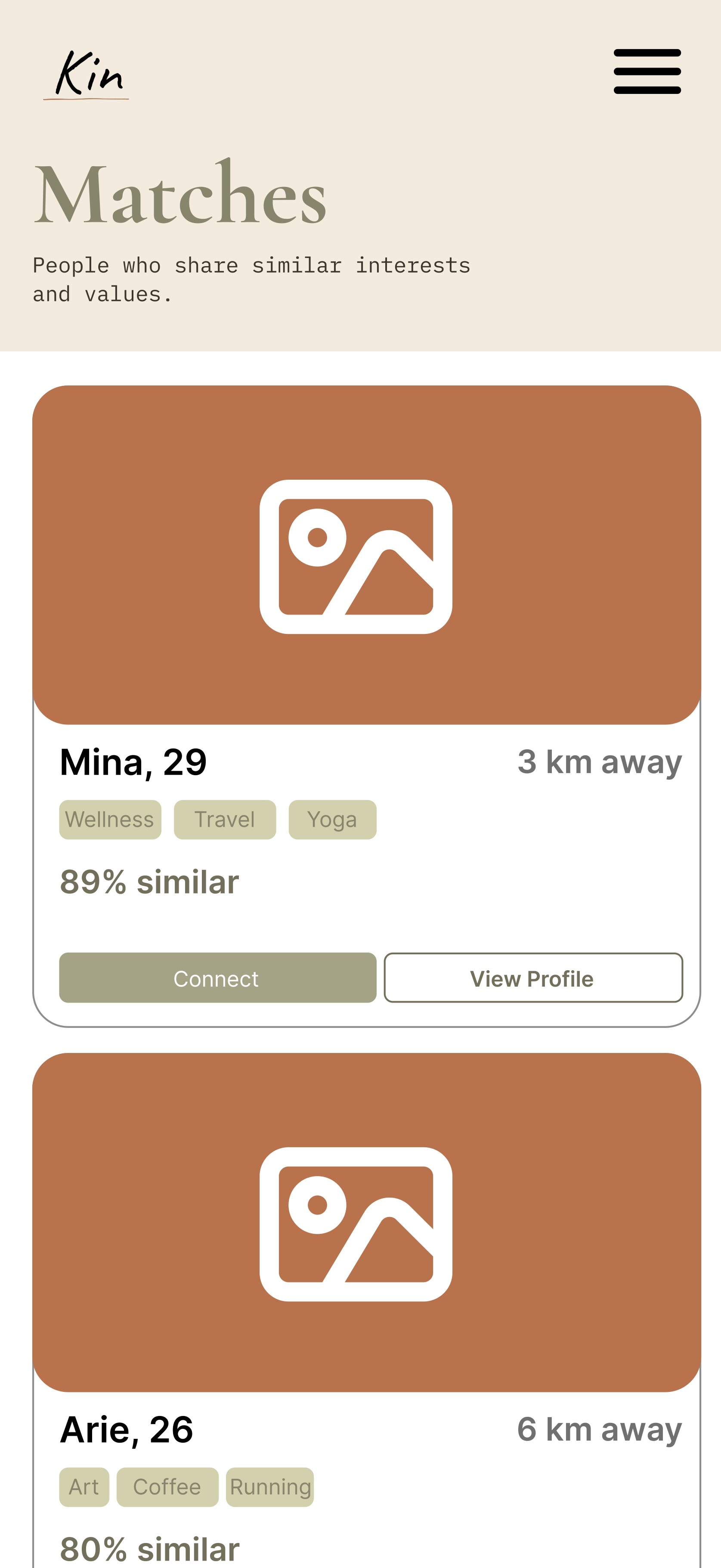
Community Matching
Helps users discover groups and people based on shared interests, background, language, or location.
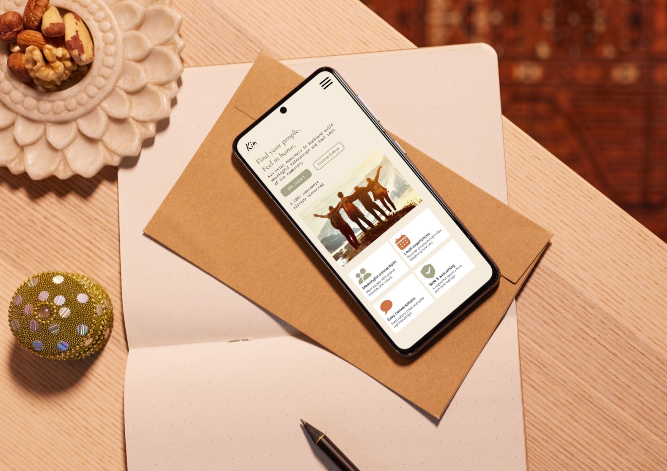
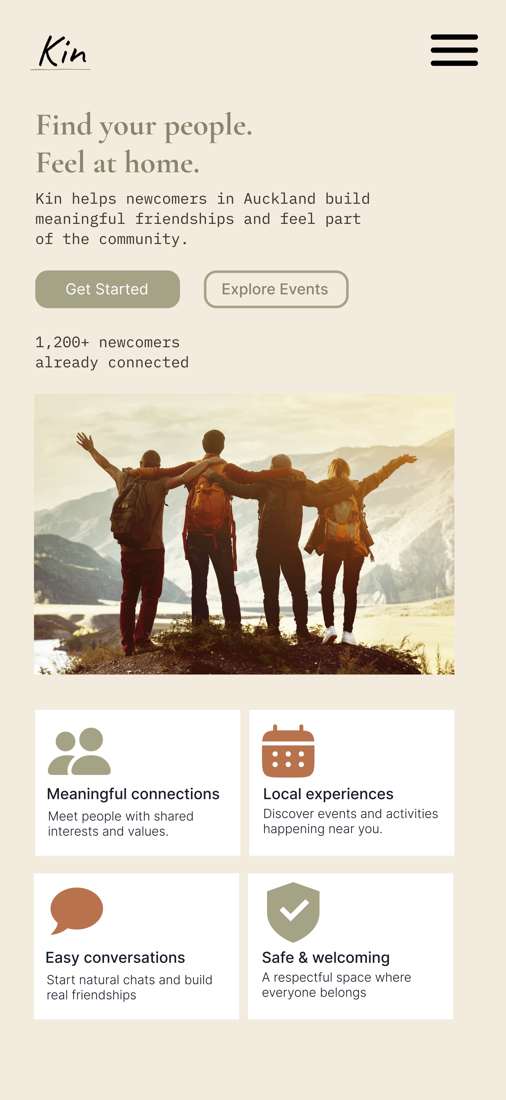
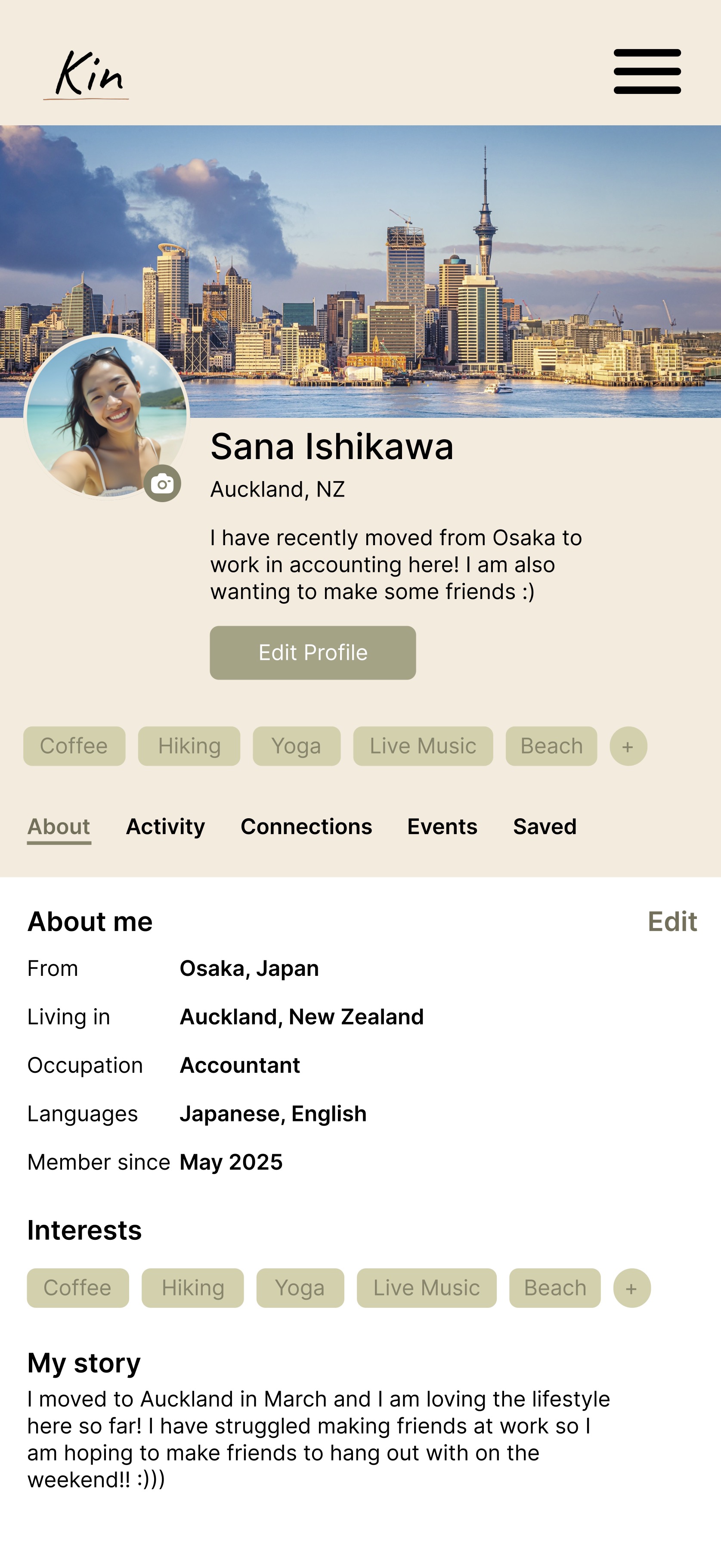
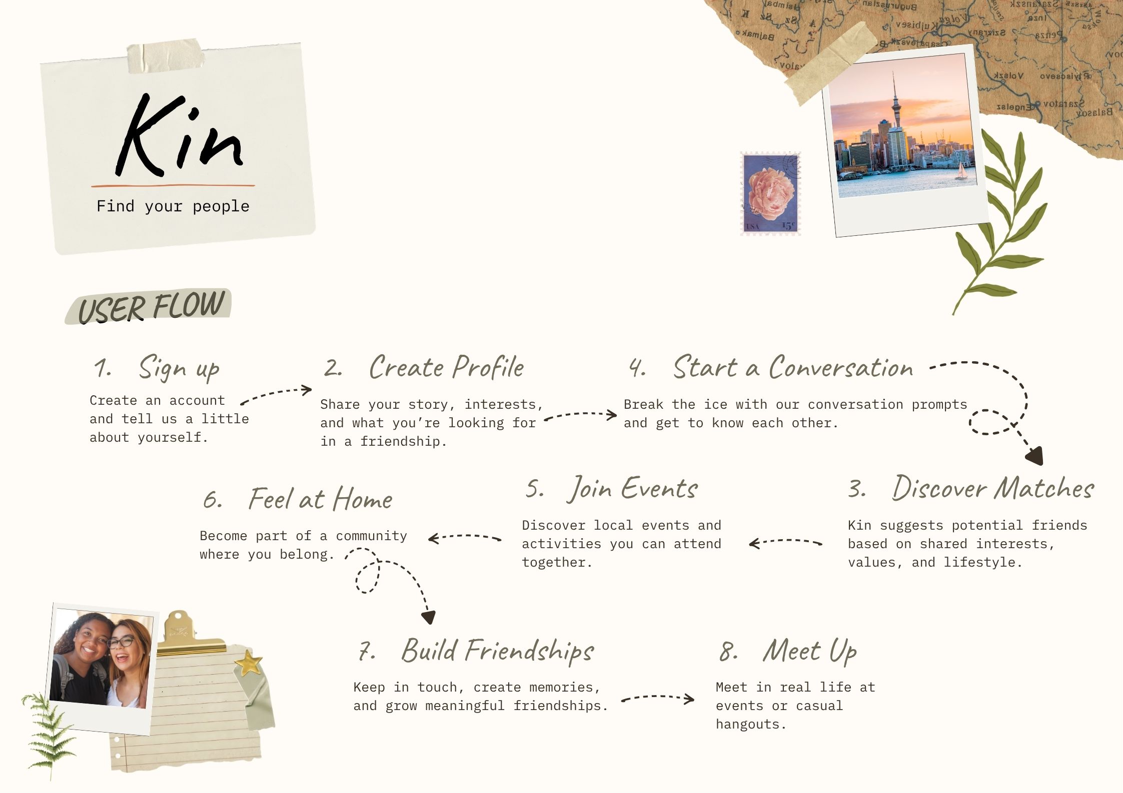
Kin is a mobile app concept designed to help new immigrants feel more at home by connecting them with local communities, shared experiences, and supportive social spaces.
Problem
Goal
My Role
THE PROBLEM
New immigrants often have to rebuild their sense of home from scratch. Everyday things like finding local support, meeting people, understanding cultural expectations, or discovering community events can become emotionally exhausting when everything feels unfamiliar.
Kin was designed around the idea that settling into a new country is not only about practical information. It is also about connection, comfort, identity, and finding people who make a place feel less distant.
RESEARCH INSIGHTS
Kin focuses on gentle ways to discover people, groups, and events rather than forcing users into overwhelming social interactions immediately.
The app helps users find communities connected to shared languages, cultures, interests, and lived experiences.
Kin combines social connection with helpful local information, making the experience feel supportive rather than purely transactional.
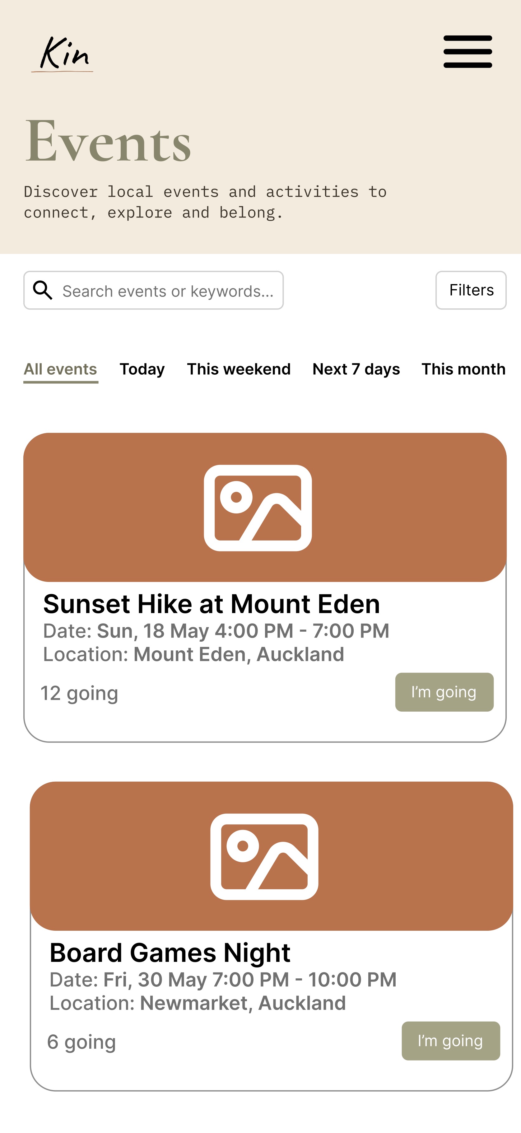
KEY FEATURES
Helps users discover groups and people based on shared interests, background, language, or location.
Surfaces community gatherings, workshops, cultural events, and casual meetups to help users connect offline.
Gives users a way to introduce themselves gently, express what they are looking for, and find others with similar experiences.
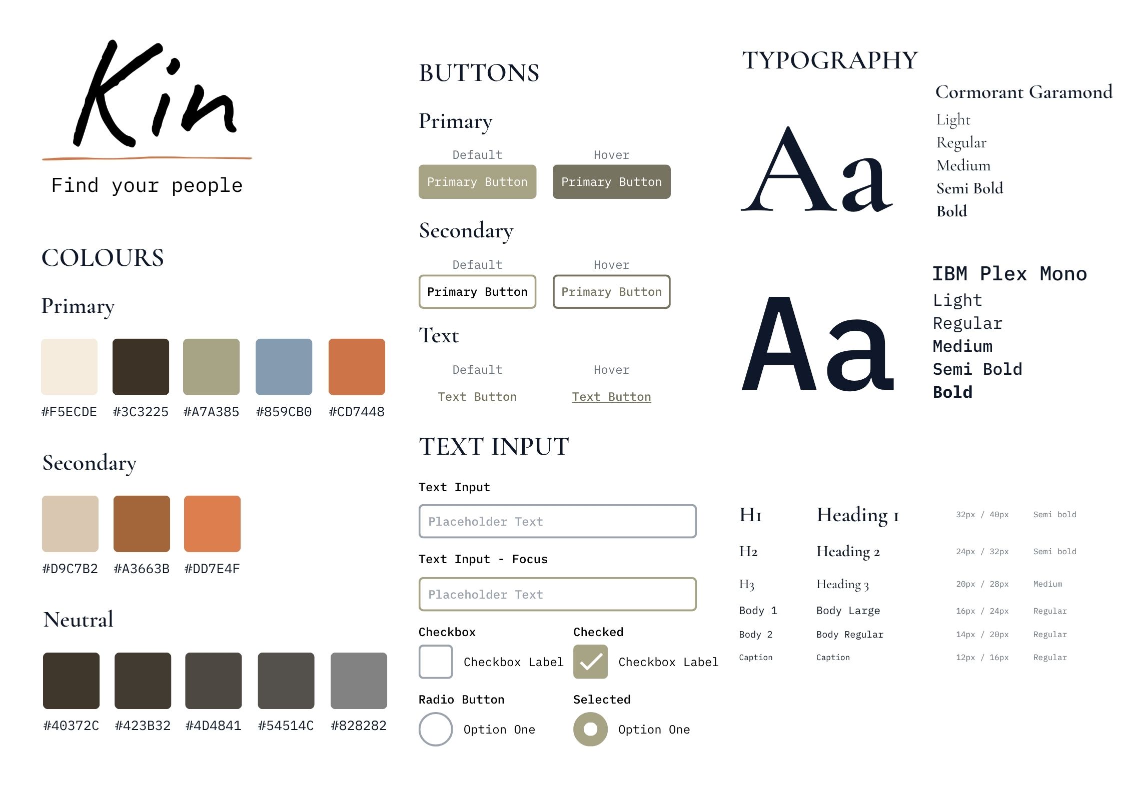
DESIGN DECISIONS
The visual direction needed to feel warm and safe rather than corporate or clinical. I focused on approachable language, simple navigation, rounded UI elements, and calm spacing to make the app feel supportive.
Because Kin deals with belonging and social connection, the design had to avoid making users feel exposed or pressured. The experience is structured around gradual discovery, allowing users to explore communities and events at their own pace.
FULL PROCESS DOCUMENTATION
The complete report includes research findings, user flows, wireframes, iterations, design rationale, and deeper explanations behind the product decisions that shaped Kin.
Read Full ReportREFLECTION
Kin helped me think more carefully about emotional UX. Designing for belonging means considering not only what users need to do, but how they might feel while doing it. This project taught me how visual design, language, and interaction flow can all contribute to making a digital experience feel more supportive.