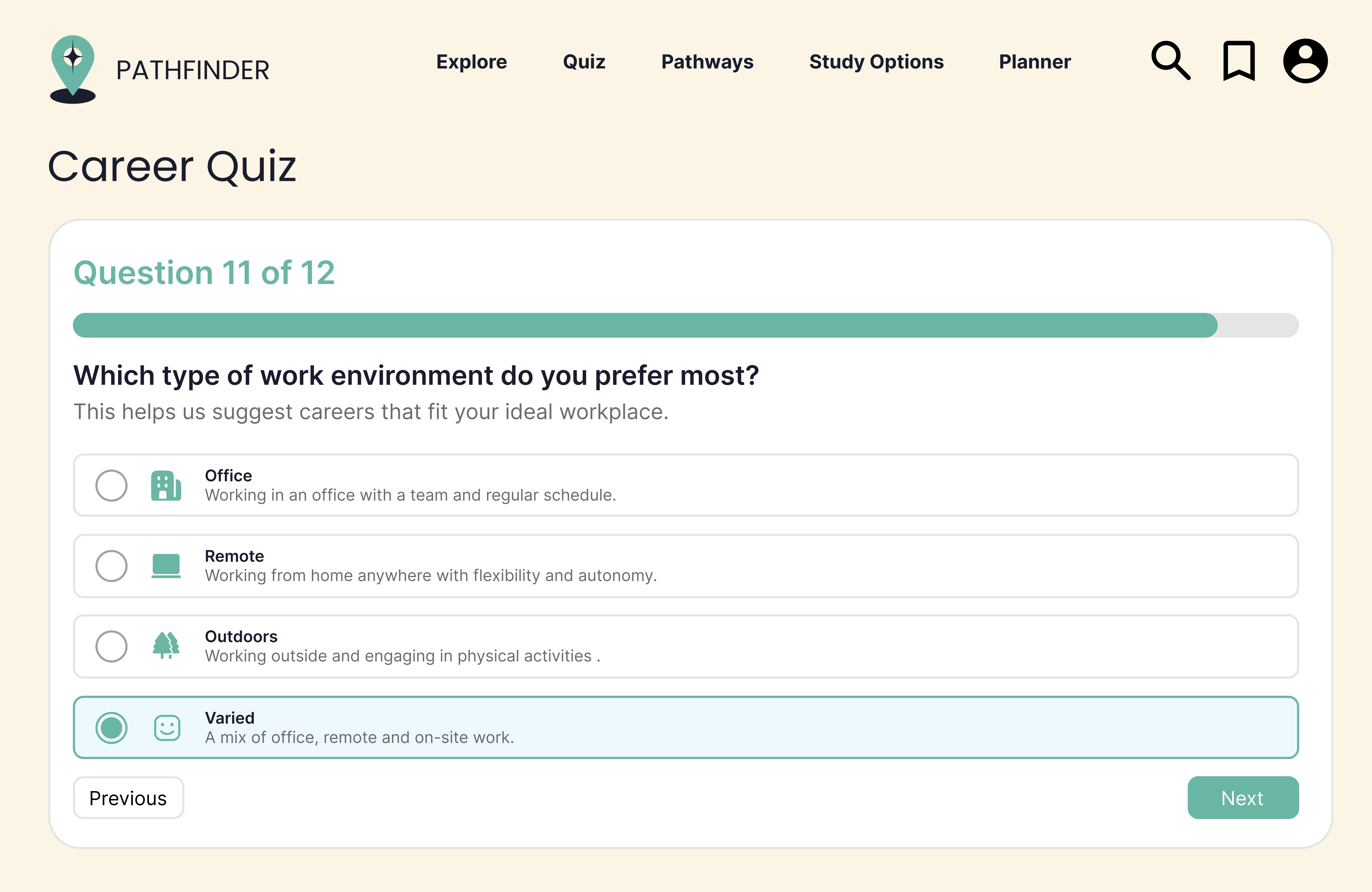
Career Quiz
Helps students discover possible pathways based on their interests, rather than expecting them to search from a blank page.
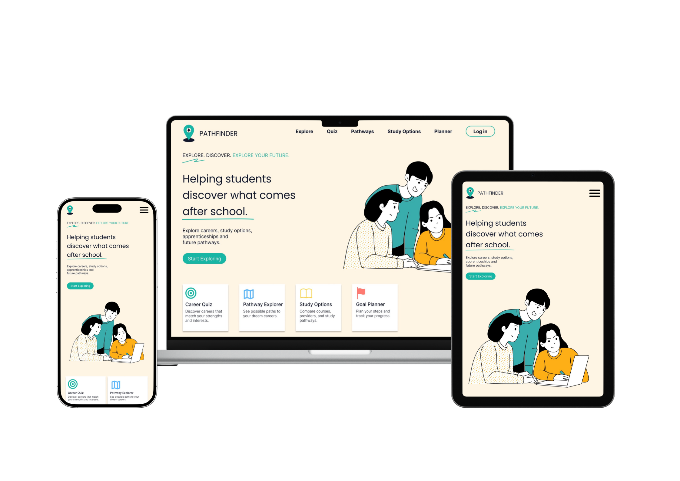
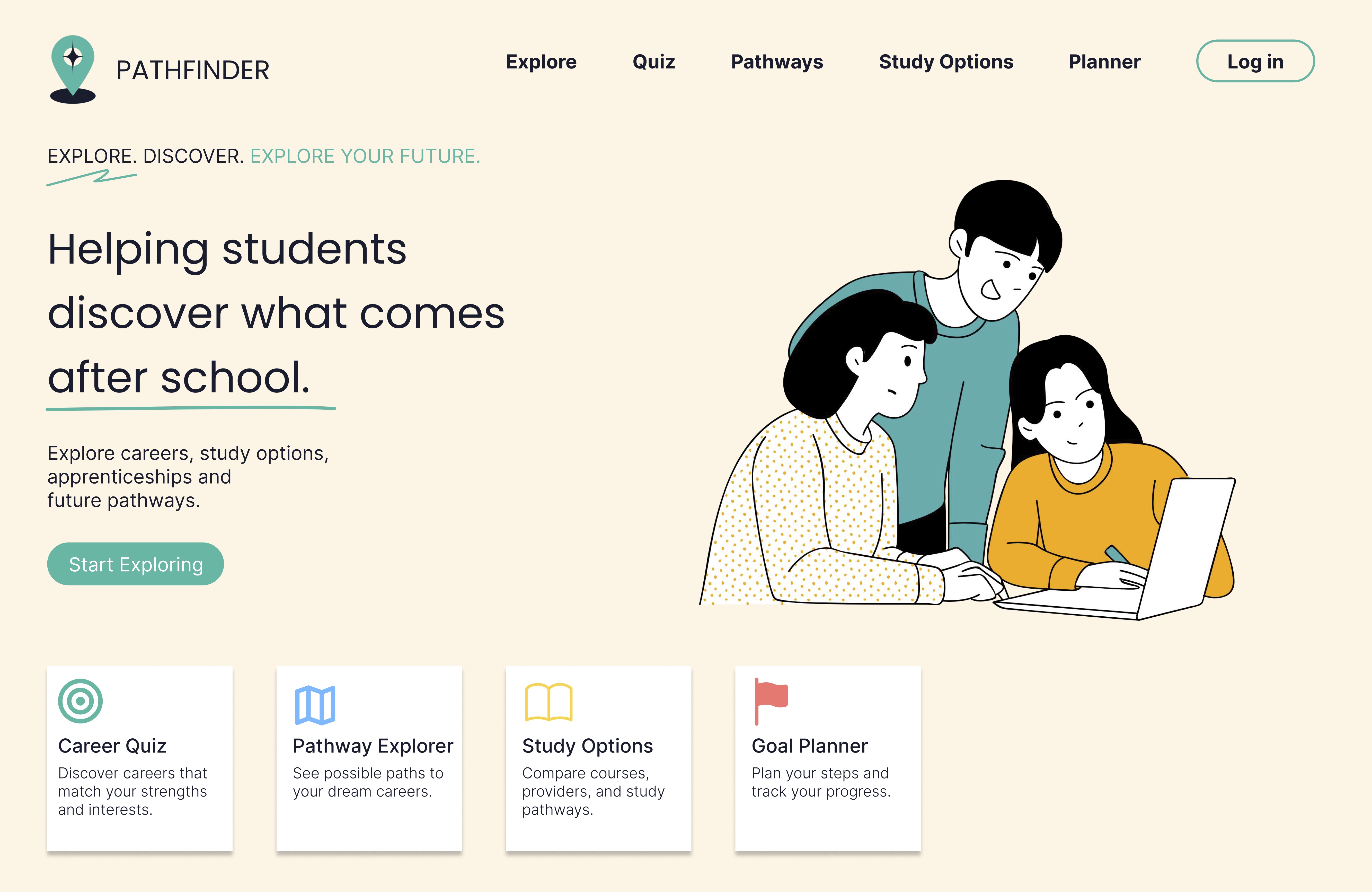
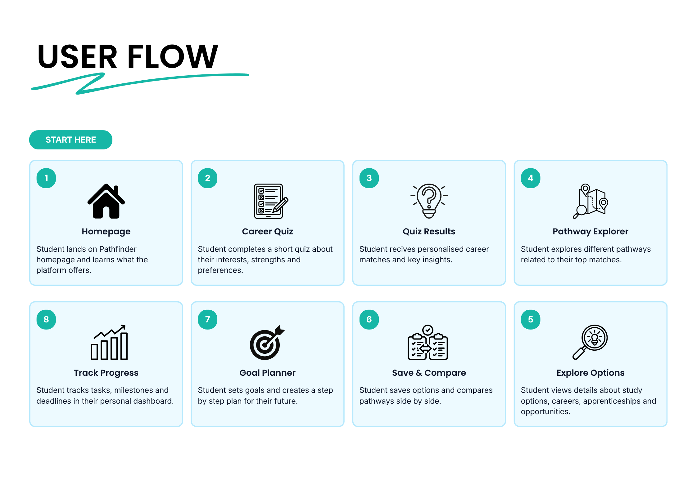
Pathfinder is a responsive website that helps high school students explore life after graduation through career quizzes, goal-setting tools, and a feature that compares up to three jobs at a time.
Problem
Goal
My Role
THE PROBLEM
Many career guidance websites assume students already know what they are looking for. They often present large amounts of information, complicated pathways, and formal language that can make future planning feel more stressful than helpful.
Pathfinder was designed around a softer idea: students should not need to have everything figured out before they begin. The experience gives them guided ways to explore options, reflect on goals, and compare careers without feeling overloaded.
RESEARCH INSIGHTS
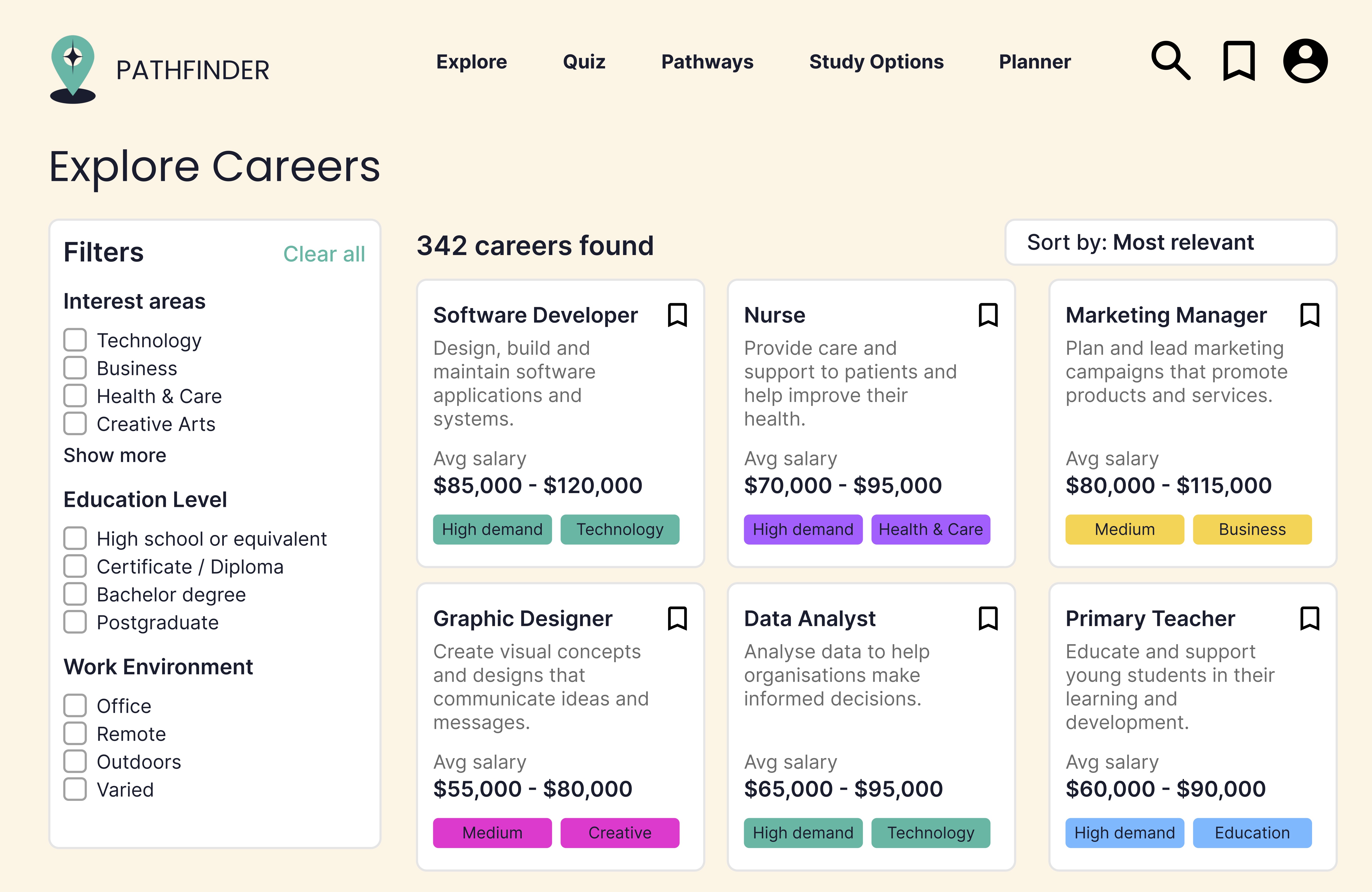
The quiz feature creates a low-pressure starting point by helping users explore careers through guided questions.
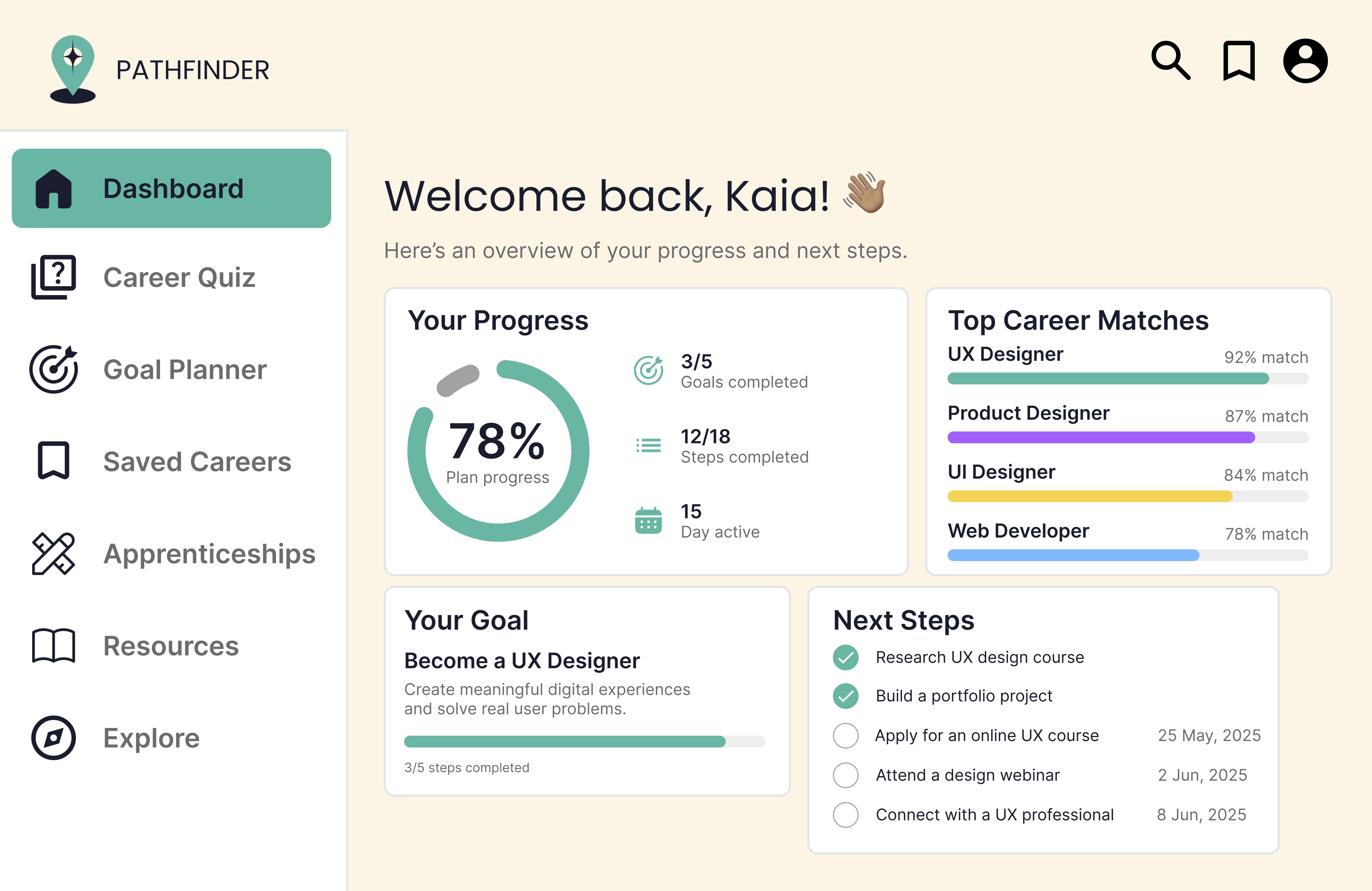
The goal feature turns future planning into clearer actions, helping users move from uncertainty into something more manageable.
The comparison feature lets users view up to three jobs side by side, reducing the effort of switching between separate pages.
KEY FEATURES
Helps students discover possible pathways based on their interests, rather than expecting them to search from a blank page.
Supports students in breaking future planning into smaller, more realistic steps.
Makes differences between careers easier to scan, helping users compare salary, study requirements, responsibilities, and fit.
DESIGN DECISIONS
I used clear hierarchy, generous spacing, and simple navigation to make the website feel less institutional. Because the subject matter can feel intimidating, the interface needed to feel approachable while still being useful.
The responsive layout was important because students may explore career options across different devices. Pathfinder needed to work as both a desktop research tool and a mobile-friendly experience.
FULL PROCESS DOCUMENTATION
The complete report includes research findings, wireframes, user flows, iterations, design rationale, responsive layouts, and deeper explanations behind key UX decisions made throughout the 8 week process.
Read Full ReportREFLECTION
This project helped me understand how UX design can support decision-making by reducing cognitive load. I learned that simplifying an experience is not about removing detail, but about presenting information at the right moment, in the right structure.